
Week 11 — Data Visualization and APIs
- Data is everywhere ⟶ apps, sensors like fitbits, financial data, information about cities etc.
- This week ⟶ data formats, loading data into p5js, the table structure (like an excel spreadsheet: rows and columns), process for data visualization and other tools.
Concept Review
Mapping values
The most important thing in data visualization ⟶ map values from one range to another.
// map(value, input min, input max, output min, output max)
var mappedMouse = map(mouseX, 0, width, 0, 1);
text("mappedMouse is " + mappedMouse, width / 2, height / 2);
Code in folder /11.2-MappingValues
Looping through data
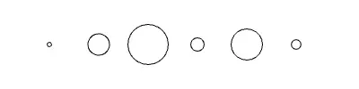
- Loop through an array of data and use the values as diameters of circles ⟶ bubble chart.
- Know the minimum and maximum values of the data. Small data ⟶ by eye. Large data ⟶ min() and max().
- 1.2 pixels is hard to see ⟶ map the data to a visible range.
var data = [1.2, 3.5, 6, 2.4, 4.8, 1.9];

function draw() {
    background(255);
    translate(0, height / 2);
    for (var i = 0; i < data.length; i++) {
        translate(55, 0);
        var circleSize = map(data[i], min(data), max(data), 5, 45);
        ellipse(0, 0, circleSize, circleSize);
    }
}
Code in folder /11.2-BubbleChart
Data Formats
-
CSV ⟶ Comma Separated Values
-
TSV ⟶ Tab Separated Values
-
JSON ⟶ JavaScript Object Notation
-
XML ⟶ Extensible Markup Language
-
CSV and TSV ⟶ formatted like a table (excel spreadsheet).
-
JSON and XML ⟶ common on the web and with APIs.
-
JSON looks like javascript object literals. XML looks like HTML (tags).
Table Structured Data
CSV ⟶ each cell is separated by a comma, each row ends with a new line character.
,ANNUAL,JAN,FEB,MAR,APR,MAY,JUN,JUL,AUG,SEP,OCT,NOV,DEC,YEARS,# CITIES
Average Temperature (F),7,24.5,18.3,10,3.4,-0.8,-4.3,-6.7,-7.1,-3.5,4.6,15.7,23.7,23,48
TSV ⟶ same, but separated by tabs.
- Open the data in both a spreadsheet program (Excel, Google Sheets, OpenOffice) and a text editor.
- Formatting matters ⟶ know what the data looks like in both.
Data used this week ⟶ /data/antarctica_weather_averages.csv
Object Structured Data
JSON ⟶ keys and values. Unlike javascript objects, keys must be in quotation marks.
[
    { "time": 8, "number_of_pushups": 12, "exhaustion": 2 },
    { "time": 12, "number_of_pushups": 10, "exhaustion": 6 }
]
XML ⟶ tags and attributes.
<row annual="7" jan="24.5" feb="18.3"></row>- Convert between formats ⟶ Mr. Data Converter by Shan Carter
Data hygiene
- Most problems in a visualization come from the data itself. eg., weird spikes.
- Check the data in a text editor for trailing spaces or new lines where there shouldn’t be.
Loading Data
- preload() ⟶ runs before setup. Load heavy files (large CSVs, images) here. Everything else waits until the data is loaded.
- loadTable() ⟶ loads a CSV/TSV file into a table.
// path to the file
loadTable("data/data.csv");

// options ⟶ file type, header ⟶ skip the header row when reading the data
loadTable("data/data.csv", "csv", "header");

// callback ⟶ runs after the file is loaded (asynchronous)
loadTable("data/data.csv", "csv", "header", function (table) {
    // do something with the table
});- Keep data files in a folder called data inside the project folder.
Example (code in folder /11.6-LoadTable)
var table;

function preload() {
    table = loadTable("../data/antarctica_weather_averages.csv", "csv", "header");
}

function setup() {
    createCanvas(400, 400);
    textAlign(CENTER);
    text(table.getRowCount(), width / 2, height / 2); // 4
    text(table.getColumnCount(), width / 2, height / 2 + 35); // 16
}
getColumn, getRow & Iteration
getColumn
- table.getColumn(“column name”) ⟶ returns an array of the values in a column.
- Values from a CSV are strings ⟶ convert to numbers using Number().
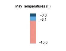
Example: May temperatures as a stacked bar chart (code in folder /11.7-GetColumn)
var colors = ["#1B4F72", "#5DADE2", "#F1948A"];

function setup() {
    createCanvas(400, 400);
    columnData = table.getColumn("MAY");
    // leave out precipitation
    temperatures = columnData.slice(0, columnData.length - 1).map(Number);
}

function draw() {
    background(255);
    translate(width / 2 - 10, height / 4);
    noStroke();
    for (var i = temperatures.length - 1; i >= 0; i--) {
        var mappedData = map(temperatures[i], min(temperatures), max(temperatures), 100, 10);
        fill(colors[i % colors.length]);
        rect(0, 0, 20, mappedData);
        fill(0);
        text(temperatures[i], 45, mappedData);
    }
}- Output range is reversed (100 to 10) ⟶ the lowest temperature is the tallest bar.
- Loop backwards ⟶ draw the tallest bar first, otherwise it covers the shorter bars.
- colors[i % colors.length] ⟶ modulo keeps looping around the color palette without going out of the array.
- Color palette from Adobe Color
- Always label the data. Data without labels is not useful.
getRow
- table.getRow(index) ⟶ returns a row object. .arr ⟶ array representation of the row.
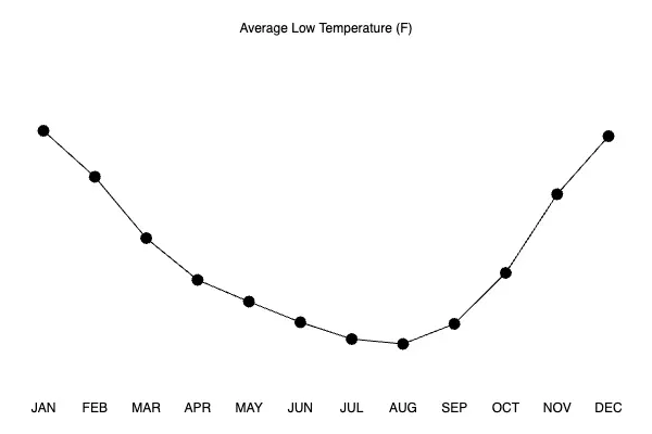
- Row index starts at 0 ⟶ getRow(2) is the third row (Average Low Temperature).
Example: Line chart of average low temperatures (code in folder /11.7-GetRow)
avTemperatureData = table.getRow(2).arr;

function draw() {
    background(255);
    translate(0, height / 2);
    noFill();
    beginShape();
    // index 0 ⟶ label, 1 ⟶ ANNUAL, 2 to 13 ⟶ JAN to DEC
    for (var i = 2; i < 14; i++) {
        var temp = avTemperatureData[i] * 5;
        var x = margin + ((width - margin * 2) / 11) * (i - 2);
        vertex(x, -temp);
    }
    endShape();
}- -temp ⟶ y increases down the page, so negate to draw higher temperatures at the top.
- translate() doesn’t work inside beginShape/endShape ⟶ calculate x for each vertex.
- Antarctica is in the southern hemisphere ⟶ coldest months are June to September.
Iterating through every entry
Nested for loops ⟶ columns and rows. table.getString(row, column) ⟶ value of a cell as a string.
for (var c = 0; c < table.getColumnCount(); c++) {
    for (var r = 0; r < table.getRowCount(); r++) {
        var data = table.getString(r, c);
        push();
        if (c === 0) {
            translate(0, r * 20);
        } else {
            translate(c * 25 + 150, r * 20);
        }
        text(data, 0, 0);
        pop();
    }
}- push and pop around translate in a loop, otherwise the translations add up.
Code in folder /11.7-IterateTable
loadJSON
- Created a JSON file from CSV like data using Mr. Data Converter (output as JSON - Properties).
- loadJSON(path, callback) ⟶ the callback receives the data.
var myData = [];

function setup() {
    createCanvas(400, 400);
    loadJSON("../data/number_of_pushups.json", function (data) {
        myData = data;
    });
}

function draw() {
    background(220);
    var i = 0;
    for (const element of myData) {
        ellipse(i * 50 + 25, height / 2, element.number_of_pushups, element.number_of_pushups);
        i++;
    }
}- Data inside the callback is only available inside it (scope) ⟶ assign it to a global variable to draw with it.
- The JSON starts and ends with square brackets ⟶ it is an array of objects.
- for…of ⟶ loops through the elements of an array. No index, so i is counted separately.
- const ⟶ read only variable, can’t be reassigned.
Code in folder /11.8-LoadJSON

Data Visualization
Stages of visualizing data - Ben Fry (co-founder of Processing, Fathom)
- Acquire ⟶ find the data, where it is sourced from, what format it is in.
- Parse ⟶ make sense of the data and the story it tells.
- Filter ⟶ remove unnecessary data.
- Mine ⟶ apply statistical methods. eg., averages, finding patterns.
- Represent ⟶ choose a basic visual model. eg., line graph, bar graph, bubble chart.
- Refine ⟶ polish the representation.
- Interact ⟶ how the user interacts with the data (mouse, keyboard, labels).
Find the story in the data before coding
- Comparison
- Trend over time
- Scale
- Web of connections (graph)
- Location (map)
Inspiration
- All Streets Limited - Fathom ⟶ every street in the United States.
- Scaled in Miles - Fathom ⟶ musical timeline of Miles Davis in circles.
- Dear Data - Giorgia Lupi and Stefanie Posavec ⟶ hand drawn data postcards, sent every week for a year between New York and London.
d3.js
- d3.js ⟶ Data Driven Documents. A javascript tool for visualizing data.
- Examples ⟶ blocks
- d3 and p5 can be used together, both are javascript ⟶ p5 d3 cookbook
<script src="https://cdnjs.cloudflare.com/ajax/libs/d3/7.8.5/d3.min.js"></script>Example: Line with d3 (code in folder /11.10-D3Line)
// d3 ⟶ global variable from the library. Chained methods
var lineGenerator = d3
    .line()
    .x(function (d, i) {
        return map(i, 0, avTemperatureData.length - 1, 0, width - margin * 2);
    })
    .y(function (d) {
        return map(d, min(avTemperatureData), max(avTemperatureData), height - margin * 2, 0);
    })
    .curve(d3.curveCardinal);

// ctx ⟶ canvas context, what p5 draws with behind the scenes
ctx = canvas.elt.getContext("2d");
ctx.stroke(new Path2D(lineGenerator(avTemperatureData)));- d3.line() ⟶ the data of the line (points and interpolation), not the drawing itself.
- .curve() ⟶ interpolation between the points. eg., d3.curveCardinal, d3.curveCatmullRom.alpha(0.5), d3.curveCatmullRomClosed. Remove it for straight lines.
- Same thing in p5 ⟶ vertex() for straight lines, curveVertex() for curves. Less control over the curve.

Example sketches
The p5 sketches for this week, from the course repo.
11.2 — Bubble Chartrepo ↗
var data = [1.2, 3.5, 6, 2.4, 4.8, 1.9];

function setup() {
  createCanvas(400, 400);
}

function draw() {
  background(255);
  translate(0, height / 2);
  for (var i = 0; i < data.length; i++) {
    translate(55, 0);
    // data ranges from 1.2 to 6 ⟶ remap to 5 to 45 pixels
    var circleSize = map(data[i], min(data), max(data), 5, 45);
    ellipse(0, 0, circleSize, circleSize);
  }
}
11.2 — Mapping Valuesrepo ↗
function setup() {
  createCanvas(400, 400);
  textAlign(CENTER);
}

function draw() {
  background(220);
  // mouseX ranges from 0 to width ⟶ remap to 0 to 1
  var mappedMouse = map(mouseX, 0, width, 0, 1);
  text("mappedMouse is " + mappedMouse, width / 2, height / 2);
}
11.6 — Load Tablerepo ↗
var table;

function preload() {
  // path, file type, header ⟶ skip the header row
  table = loadTable("../data/antarctica_weather_averages.csv", "csv", "header");
}

function setup() {
  createCanvas(400, 400);
  textAlign(CENTER);
  background(255);
  text(table.getRowCount(), width / 2, height / 2);
  text(table.getColumnCount(), width / 2, height / 2 + 35);
}
11.7 — Get Columnrepo ↗
var table;
var columnData = [];
var temperatures = [];
// limited color palette from Adobe Color
var colors = ["#1B4F72", "#5DADE2", "#F1948A"];

function preload() {
  table = loadTable("../data/antarctica_weather_averages.csv", "csv", "header");
}

function setup() {
  createCanvas(400, 400);
  textSize(12);
  textAlign(CENTER);
  // [average, high, low, precipitation] for May
  columnData = table.getColumn("MAY");
  // leave out precipitation, only temperatures
  temperatures = columnData.slice(0, columnData.length - 1).map(Number);
}

function draw() {
  background(255);
  translate(width / 2 - 10, height / 4);
  fill(0);
  text("May Temperatures (F)", 10, -20);
  noStroke();
  // loop backwards ⟶ draw the tallest bar first so the shorter ones are drawn on top
  for (var i = temperatures.length - 1; i >= 0; i--) {
    // lowest temperature ⟶ tallest bar
    var mappedData = map(temperatures[i], min(temperatures), max(temperatures), 100, 10);
    fill(colors[i % colors.length]);
    rect(0, 0, 20, mappedData);
    fill(0);
    text(temperatures[i], 45, mappedData);
  }
}
11.7 — Get Rowrepo ↗
var table;
var avTemperatureData = [];
var margin = 40;

function preload() {
  table = loadTable("../data/antarctica_weather_averages.csv", "csv", "header");
}

function setup() {
  createCanvas(600, 400);
  textAlign(CENTER);
  // index 2 ⟶ Average Low Temperature (F). arr ⟶ array representation of the row
  avTemperatureData = table.getRow(2).arr;
}

function draw() {
  background(255);
  translate(0, height / 2);
  fill(0);
  text("Average Low Temperature (F)", width / 2, -height / 2 + 30);
  // index 0 is the label, 1 is ANNUAL, 2 to 13 are JAN to DEC
  var months = 12;
  noFill();
  beginShape();
  for (var i = 2; i < 2 + months; i++) {
    var temp = avTemperatureData[i] * 5;
    // translate doesn't work inside beginShape ⟶ calculate x
    var x = margin + ((width - margin * 2) / (months - 1)) * (i - 2);
    // negative ⟶ higher temperatures go up the page
    vertex(x, -temp);
  }
  endShape();

  fill(0);
  for (var i = 2; i < 2 + months; i++) {
    var temp = avTemperatureData[i] * 5;
    var x = margin + ((width - margin * 2) / (months - 1)) * (i - 2);
    ellipse(x, -temp, 10, 10);
    text(table.columns[i], x, height / 2 - 20);
  }
}
11.7 — Iterate Tablerepo ↗
var table;

function preload() {
  table = loadTable("../data/antarctica_weather_averages.csv", "csv", "header");
}

function setup() {
  createCanvas(600, 200);
  textSize(8);
}

function draw() {
  background(255);
  translate(20, 20);
  for (var c = 0; c < table.getColumnCount(); c++) {
    for (var r = 0; r < table.getRowCount(); r++) {
      var data = table.getString(r, c);
      push();
      if (c === 0) {
        translate(0, r * 20);
      } else {
        translate(c * 25 + 150, r * 20);
      }
      text(data, 0, 0);
      pop();
    }
  }
}
11.8 — Load JSONrepo ↗
var myData = [];

function setup() {
  createCanvas(400, 400);
  // anonymous callback, runs once the file is loaded
  loadJSON("../data/number_of_pushups.json", function (data) {
    myData = data;
    print(myData);
  });
}

function draw() {
  background(220);
  var i = 0;
  for (const element of myData) {
    ellipse(i * 50 + 25, height / 2, element.number_of_pushups, element.number_of_pushups);
    i++;
  }
}
11.10 — D3 Linerepo ↗
var table;
var avTemperatureData = [];
var margin = 40;
var ctx;

function preload() {
  table = loadTable("../data/antarctica_weather_averages.csv", "csv", "header");
}

function setup() {
  var canvas = createCanvas(600, 400);
  // native javascript ⟶ the 2D drawing context of the canvas
  ctx = canvas.elt.getContext("2d");
  // JAN to DEC of Average Temperature (F)
  avTemperatureData = table.getRow(0).arr.slice(2, 14).map(Number);
  translate(margin, margin);

  // d3 ⟶ global variable from the d3 library. Chained methods
  var lineGenerator = d3
    .line()
    .x(function (d, i) {
      return map(i, 0, avTemperatureData.length - 1, 0, width - margin * 2);
    })
    .y(function (d) {
      return map(d, min(avTemperatureData), max(avTemperatureData), height - margin * 2, 0);
    })
    .curve(d3.curveCardinal);

  strokeWeight(2);
  stroke(0);
  noFill();
  var pathLinear = new Path2D(lineGenerator(avTemperatureData));
  ctx.stroke(pathLinear);

  // same thing in p5js
  // beginShape();
  // for (var i = 0; i < avTemperatureData.length; i++) {
  //   var x = map(i, 0, avTemperatureData.length - 1, 0, width - margin * 2);
  //   var y = map(avTemperatureData[i], min(avTemperatureData), max(avTemperatureData), height - margin * 2, 0);
  //   curveVertex(x, y);
  // }
  // endShape();
}